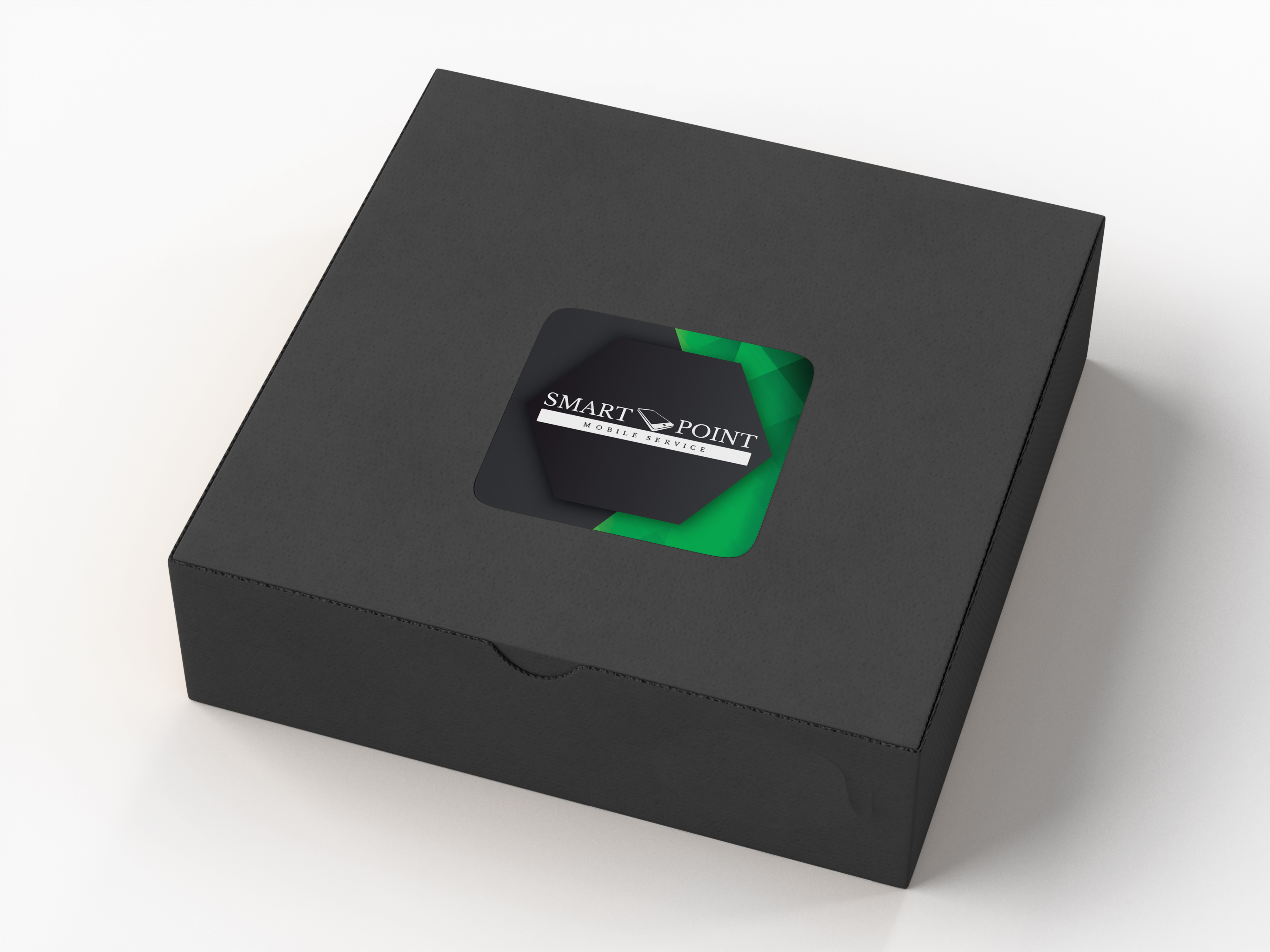
Smart Point
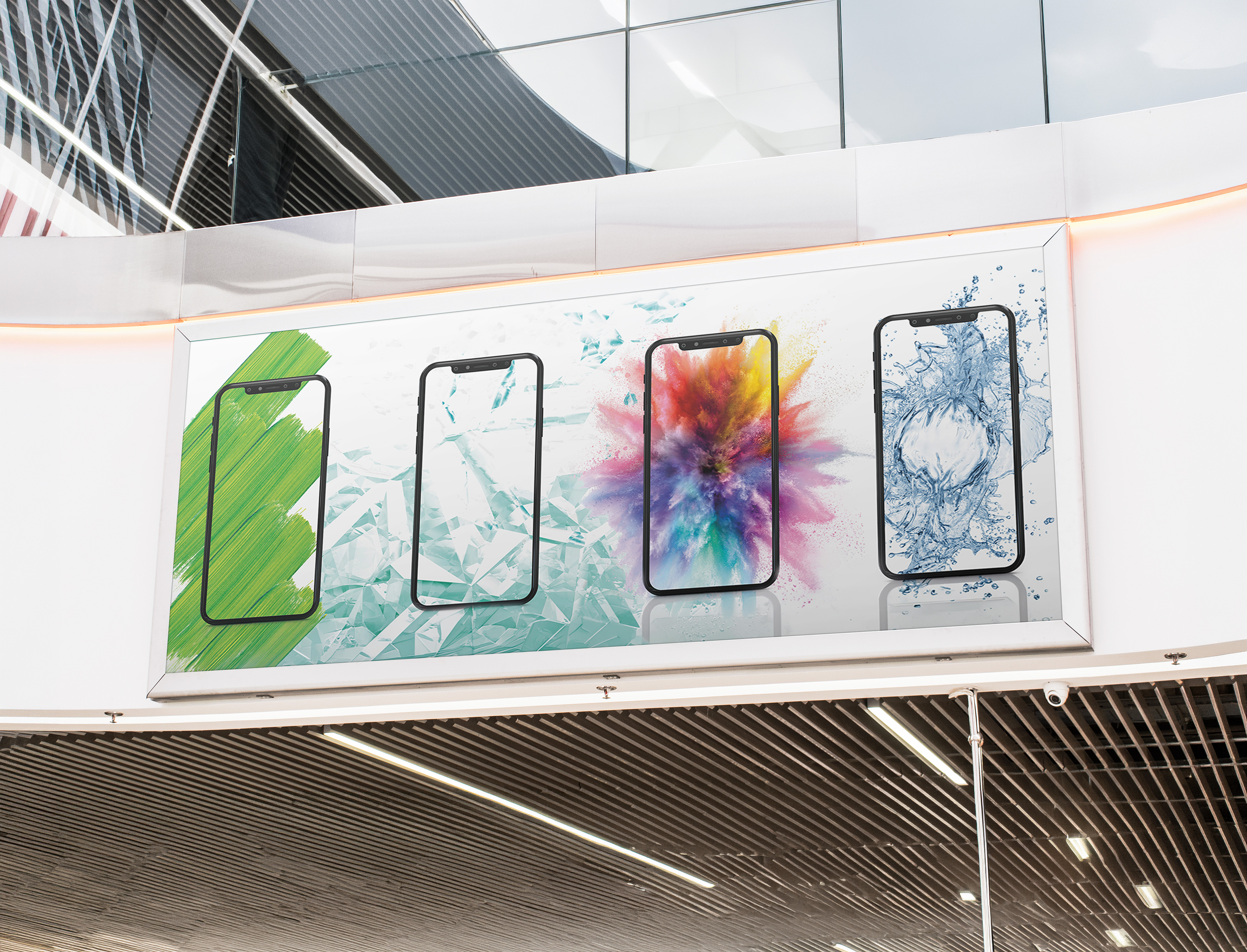
The brand lacked a consistent visual presence across customer touchpoints. The goal was to create a recognizable identity that would stand out on the street while building trust with customers.
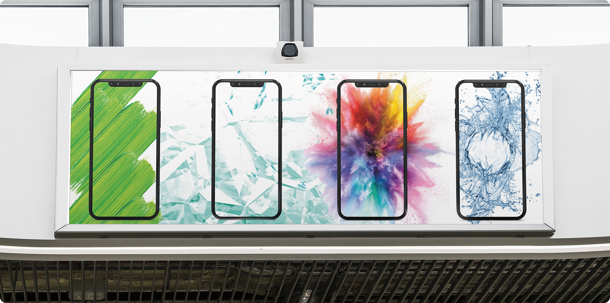
I developed a unified design system built around consistent colors, typography, shapes, and visual language. The project included large-format storefront banners, indoor entrance graphics, business cards, gift boxes, and branded collateral. Every element was designed to work together, creating a seamless experience from first impression to final purchase.
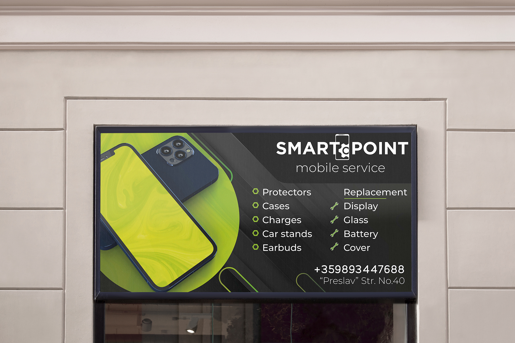
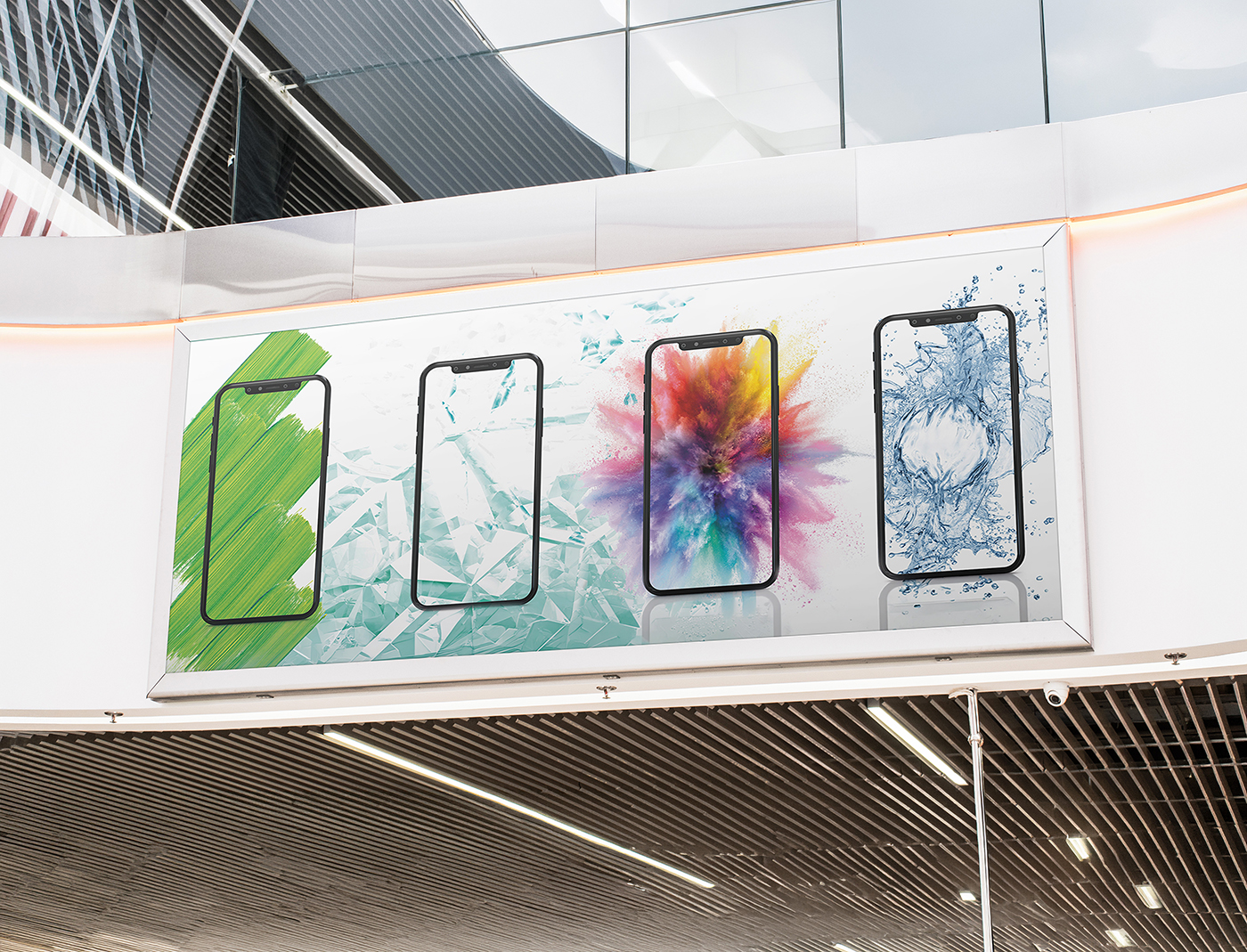
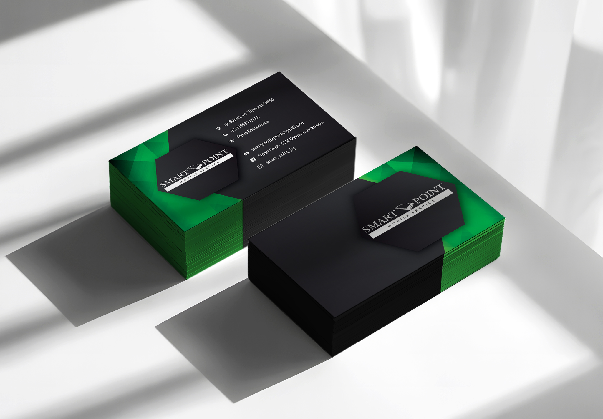
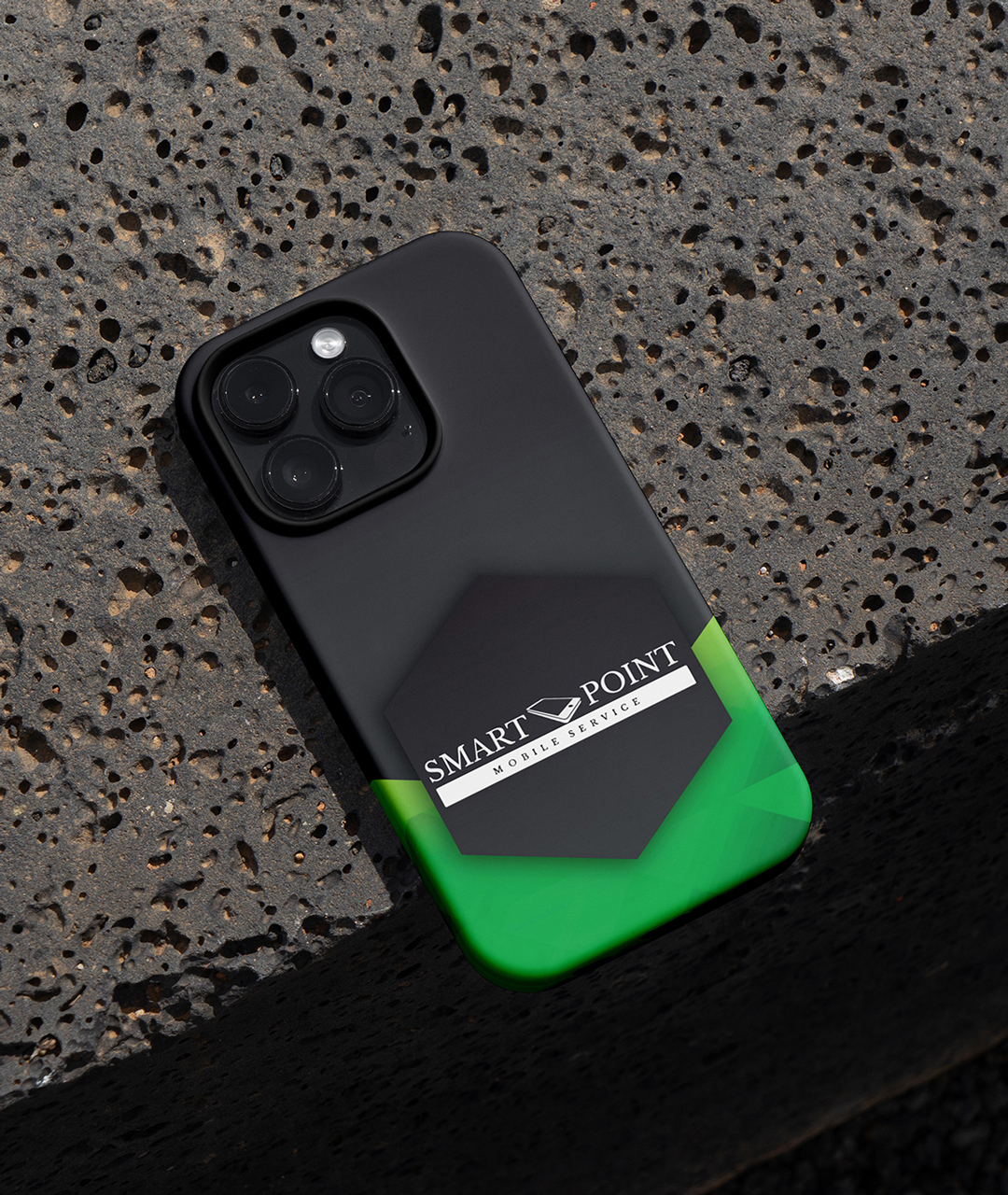
A stronger and more professional brand presence across physical touchpoints, helping Smart Point improve visibility, reinforce trust, and create a more cohesive customer experience.
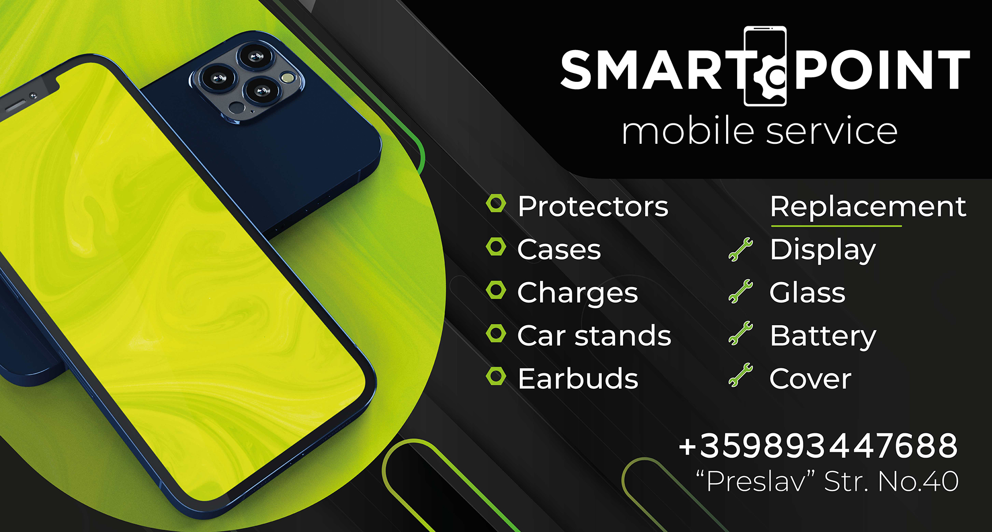
Clarity is a form of respect.
This project showed how consistency can be just as powerful as creativity. By aligning every touchpoint under a single visual system, the brand became more recognizable, memorable, and credible.
- Category
- Brand Design
- Year
- 2021